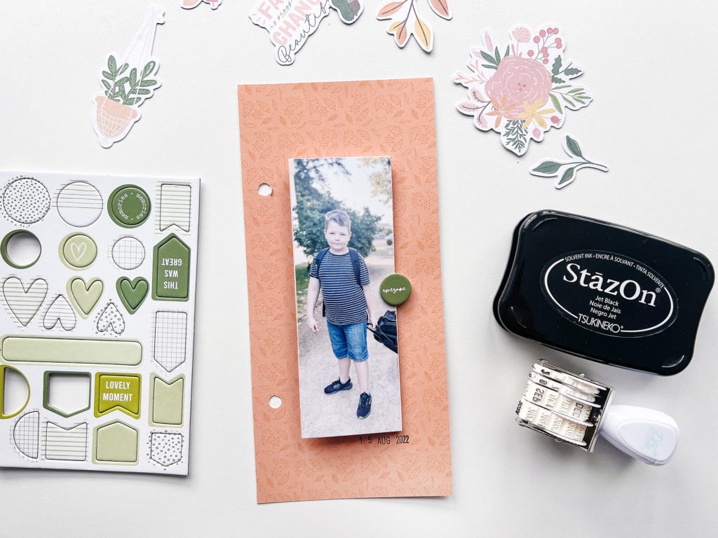
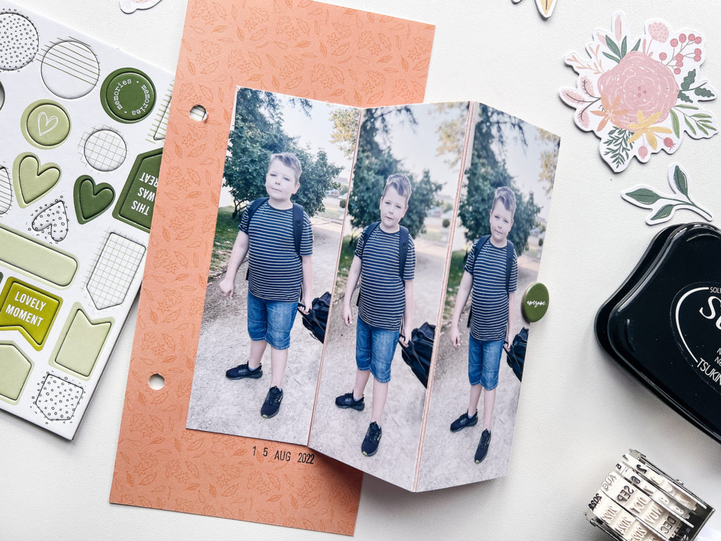
I wanted to document the story of my son going to Summer Camp a week before we went back to school with three pictures of him when I dropped him off. My first idea was to make a 6×8 layout outside of the page protector. However, three vertical photos are not a good option for that. So I decided to size down my layout and went with a 4×8.25 layout instead.

I started off by creating a fold out for my photos.

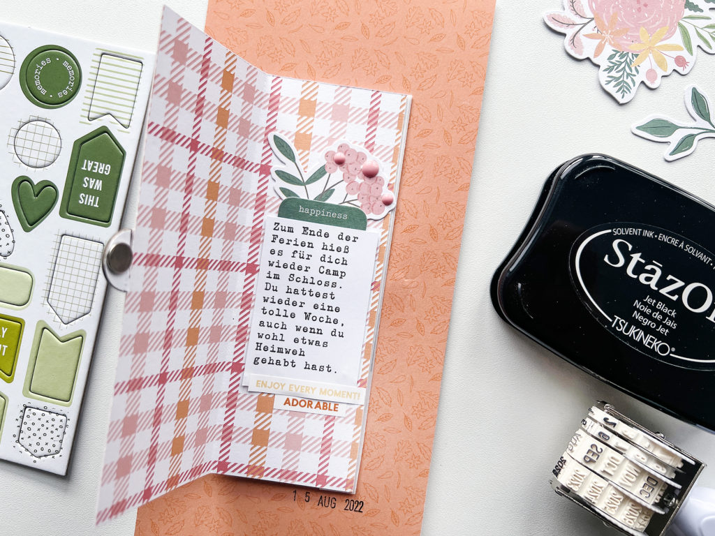
On the back I added patterned paper and my journaling. The fold out closes with a magnet and keeps everything in place.

I love how the orange of the paper goes so well with the blue in the photos.
[SUPPLIES]
- DLS Design – Genuine*: https://bit.ly/3CBi9g3
- Printer: https://amzn.to/3rw81y0
- Photo Paper: https://amzn.to/3tAbCNe
- Paper: https://amzn.to/3tCyhbR
- WRMK Multi Hole Punch: https://amzn.to/3QDqAfX
- 12″ Fiskars Paper Trimmer: https://amzn.to/3Fy2ApS
- Tweezers: https://amzn.to/30L1HXX
- Fiskars Small Scissors: https://amzn.to/3AiezHB
- StaZon Black Ink: https://amzn.to/3BaoP5o
Want to support my blog and YouTube channel? Buy me a coffee here. Your donations keep all my videos and tutorials free. Every cent is greatly appreciated and is used to cover expenses.
Disclaimer: I am part of the DLS Design Inspiration Team so the products with an * were provided to me by the manufacturer. All other products were purchased by me.
